01 / 21
01 / 21
Project details

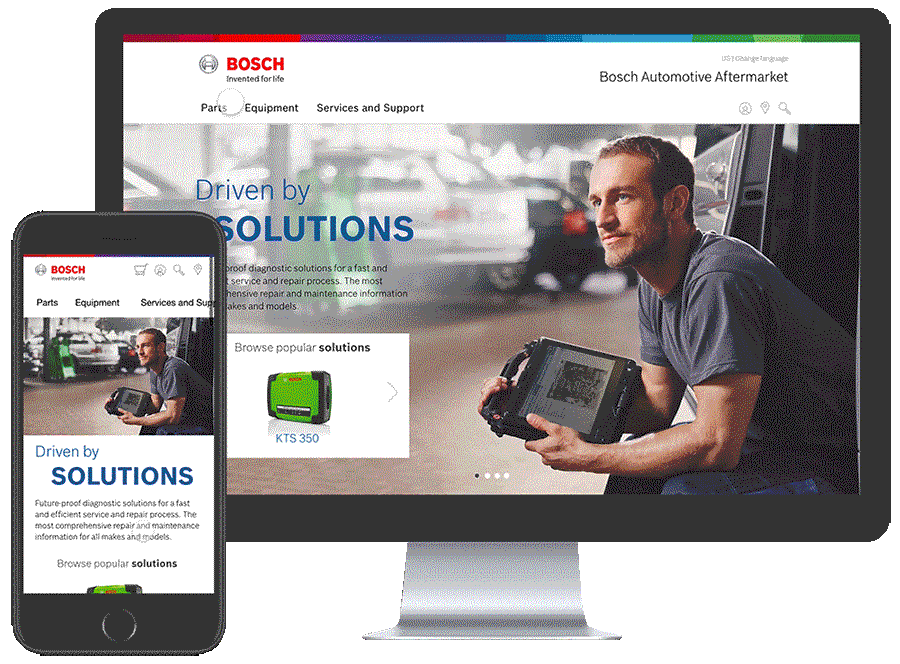
Consolidate ~60 regional Bosch Automotive websites into one global product. Implement the new digital corporate communications messaging strategy. Increase content quality and relevance, optimize information architecture and increase conversions.
Competitive analysis
Heuristic evaluations
Information architecture
Usability testing
Wireframing
Interaction design
Prototype
Visual design
Target groups were identified prior to the project. The primary audiences are the workshop owner and mechanic, followed by automotive DIYers, wholesalers, consumers and press.
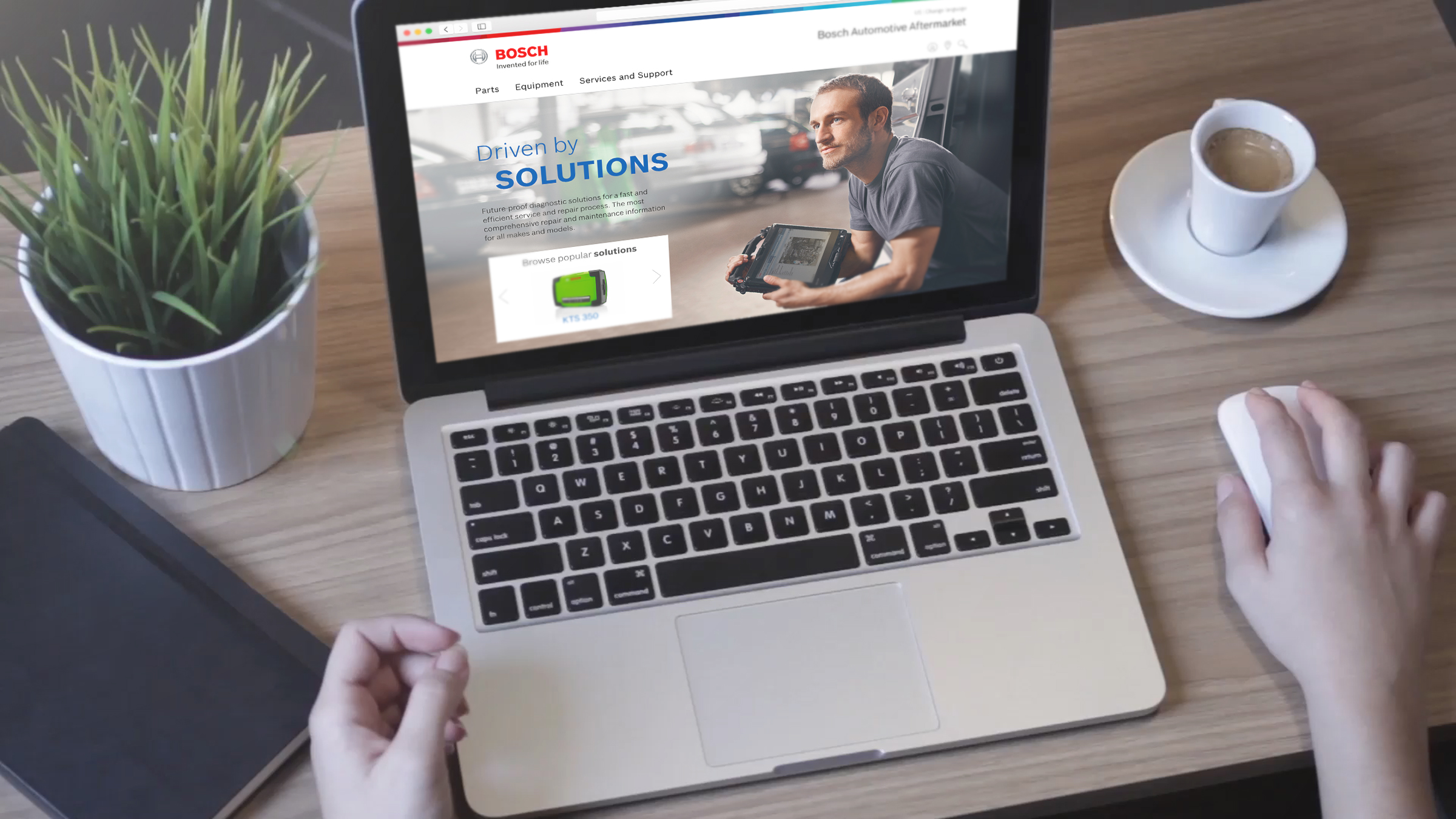
The collective global website traffic was split 62% desktop / 38% mobile so a mobile first or mobile only strategy would not be the best approach. Wireframes would need to be created for mobile and desktop simultaneously, with tablet sizes also being considered.
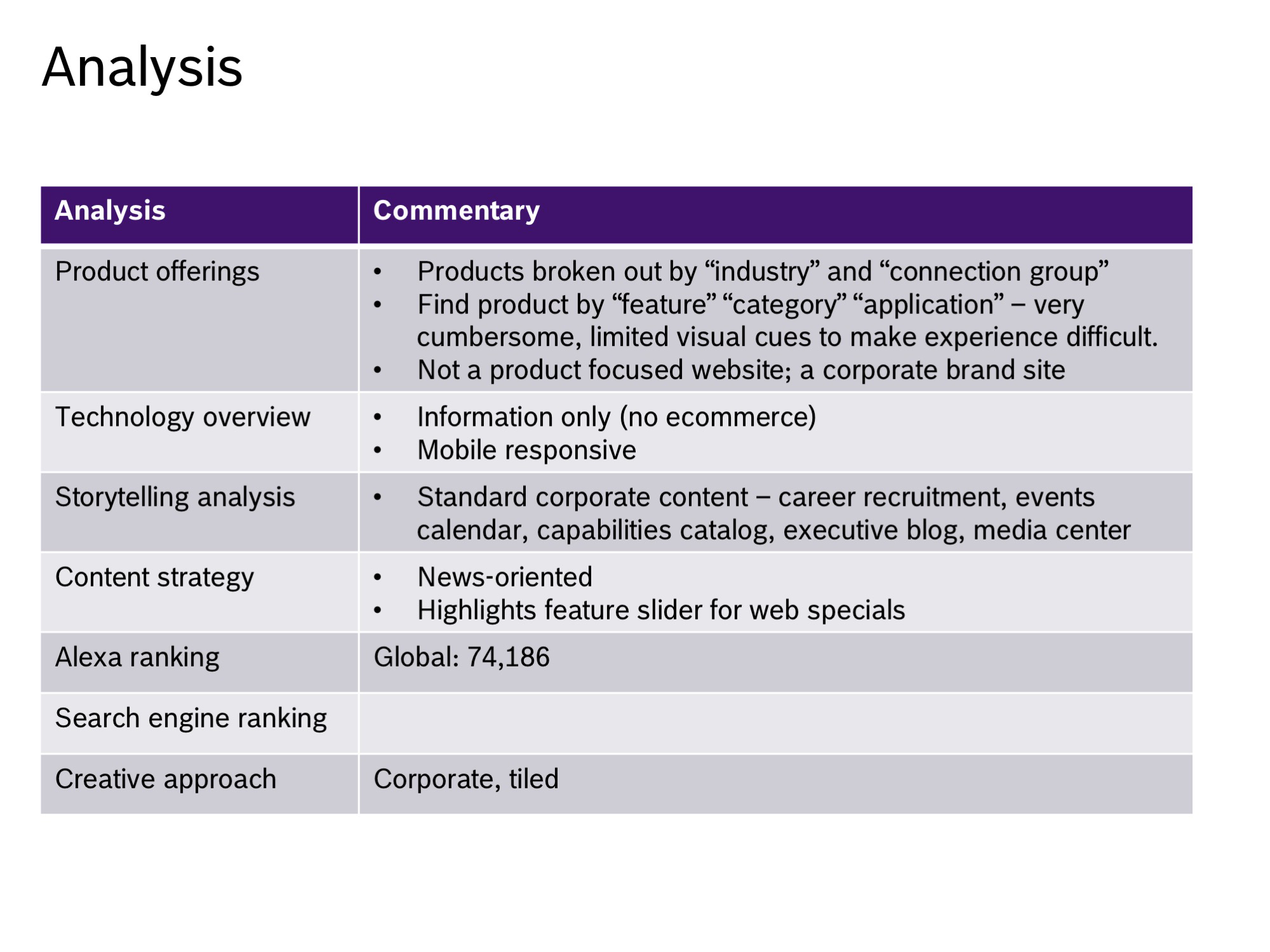
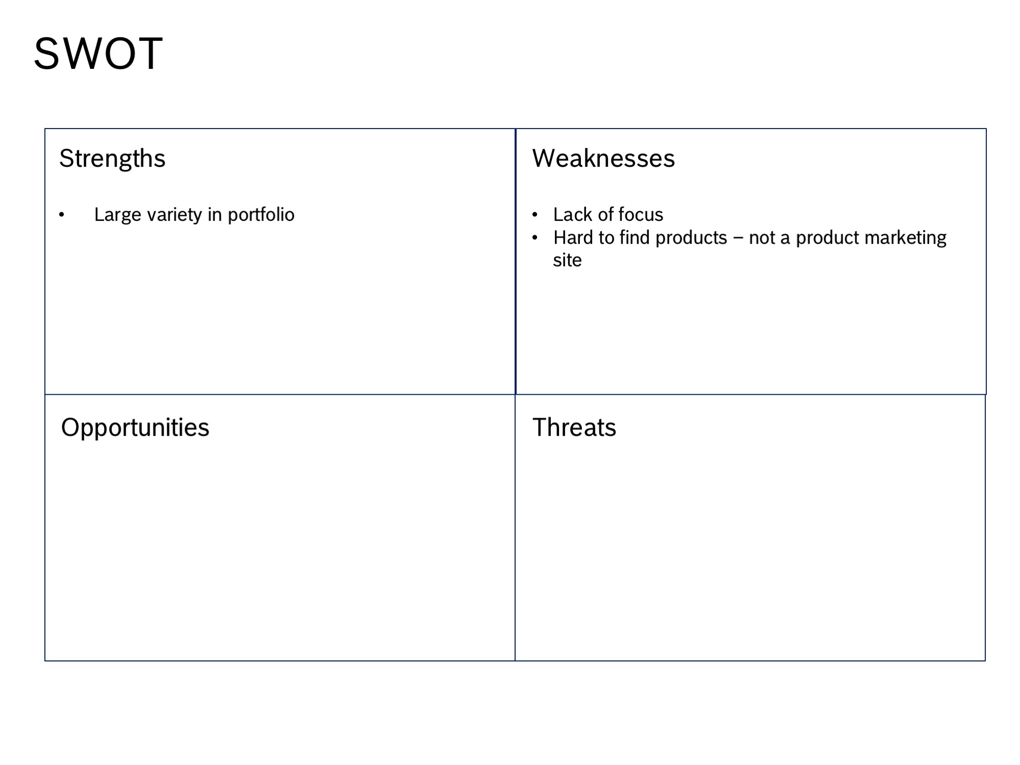
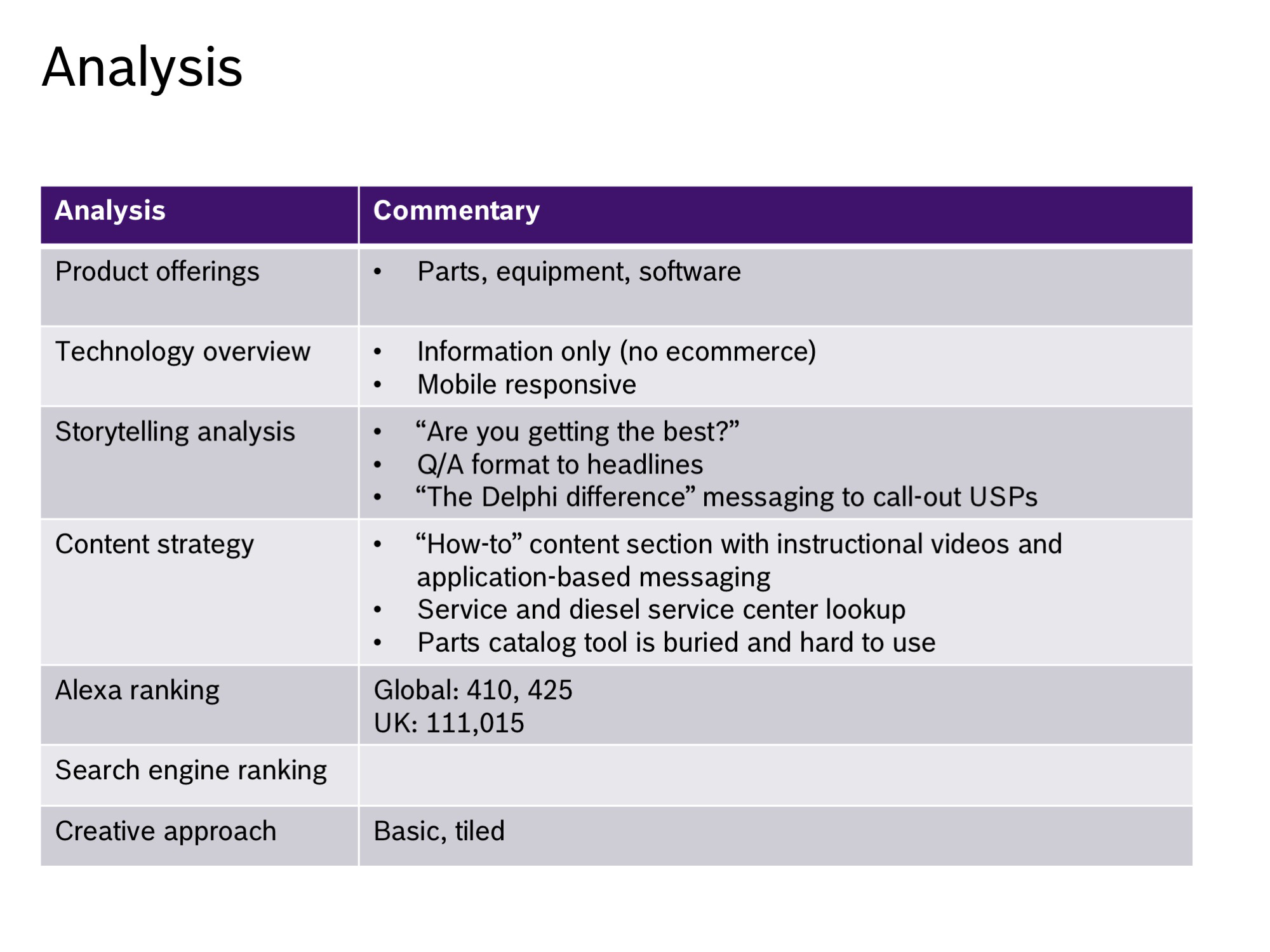
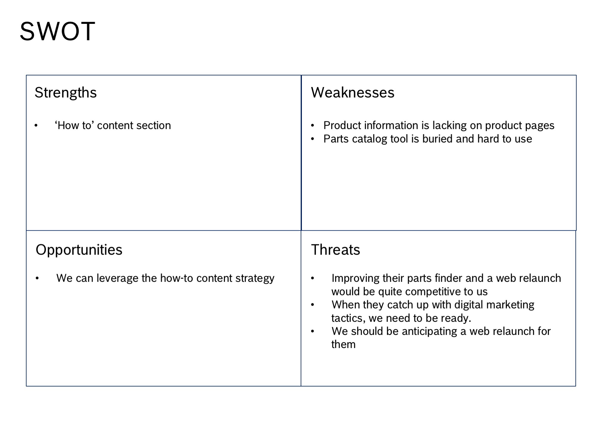
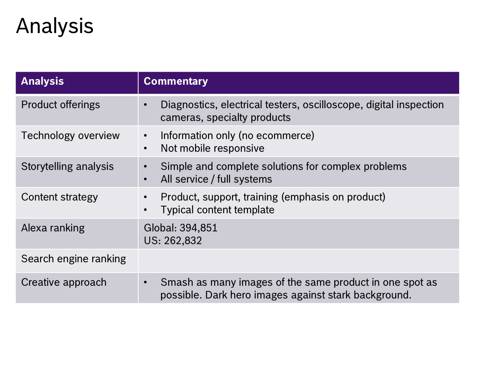
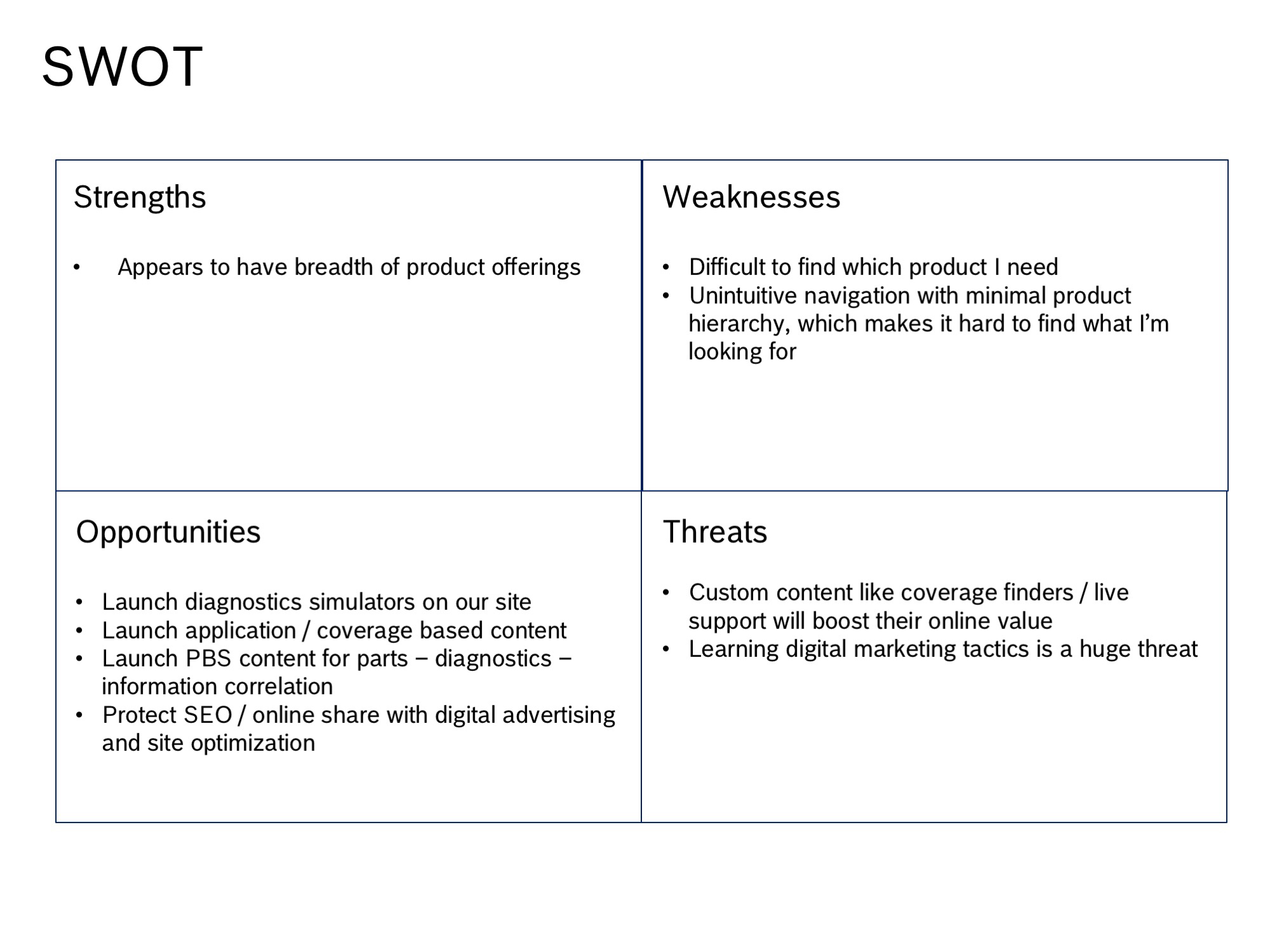
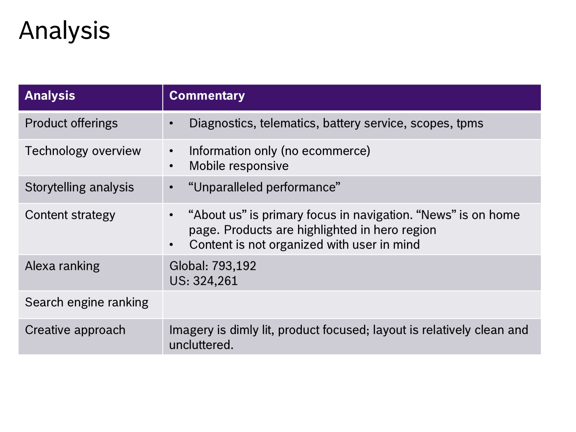
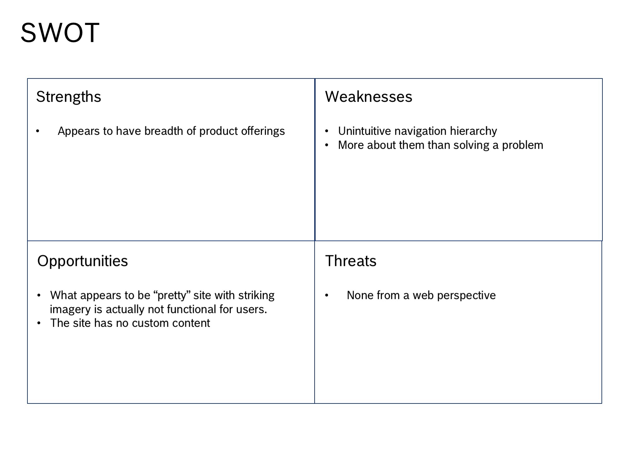
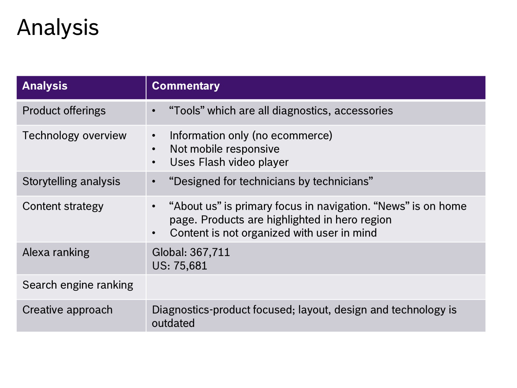
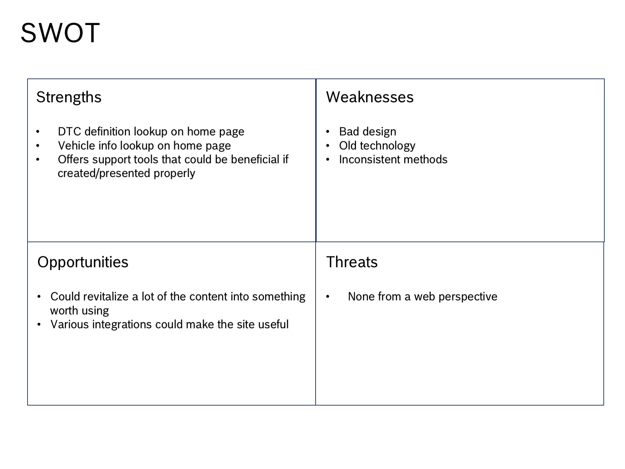
The project began by identifying key competitors, analyzing their product offerings, technology, storytelling, content strategy, Alexa ranking and general creative approach. In most cases, a SWOT analysis was also done.
I conducted a Heuristic analysis on the current regional websites and validated some of the findings with live usability tests.
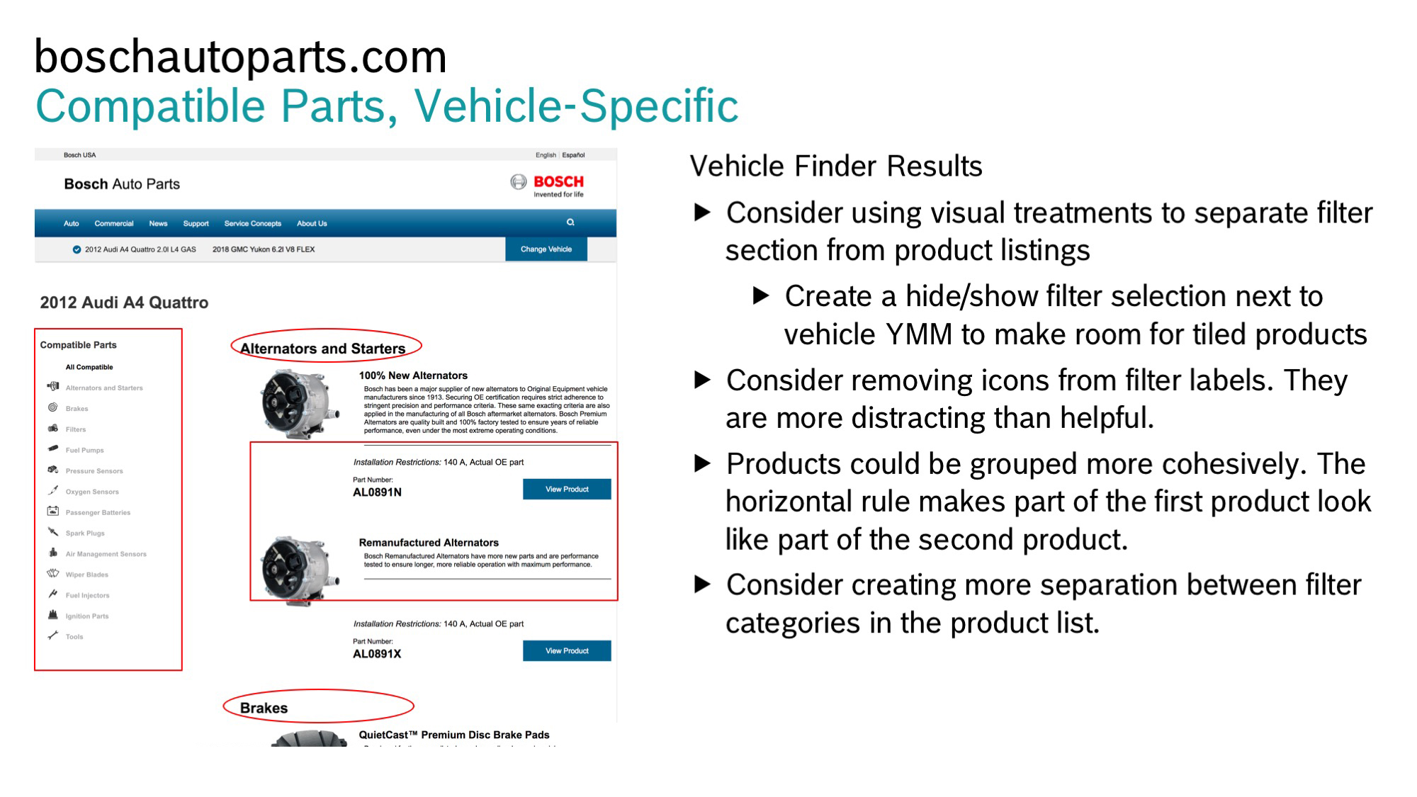
Next, I conducted audits of the existing regional websites to gain an understanding of where similarities and differences were. I used the findings as a base for establishing a lean, efficient information architecture. Armed with the full current-state sitemap categories, I worked with internal stakeholders to consolidate similar nomenclature, which revealed to me distinct pieces making up the global navigation – Parts, Equipment, Services, and Support. I conducted web-based cardsorting exercises to validate the hierarchy and I uncovered that Services and Support were often grouped interchangeably and belonged together in the minds of our primary audience.
I then asked each participant to cluster existing subcategories within the global navigation structure. Comparisons between the existing taxonomy labels were made against user search queries and subsequent adjustments were made to make the labels more clear to the user.
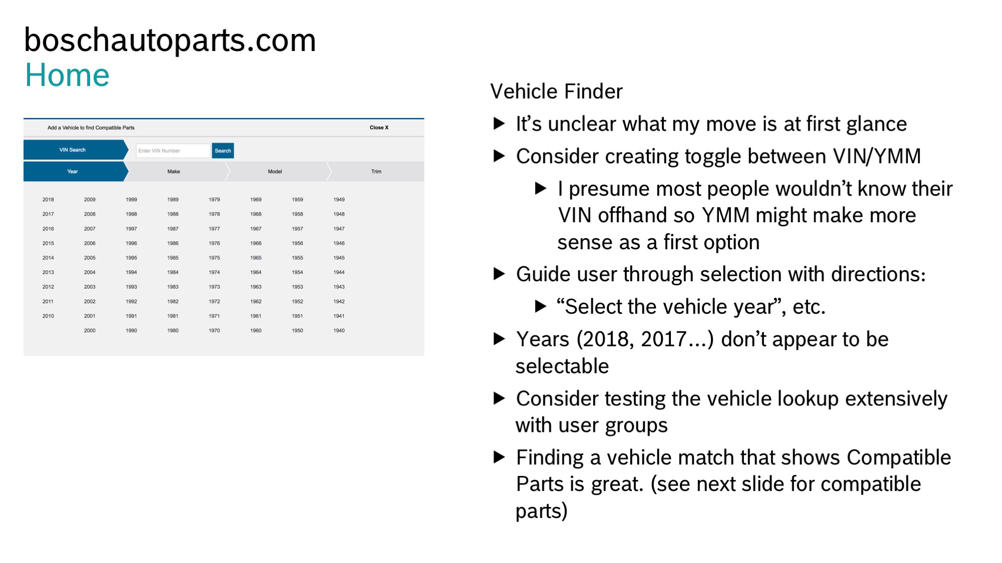
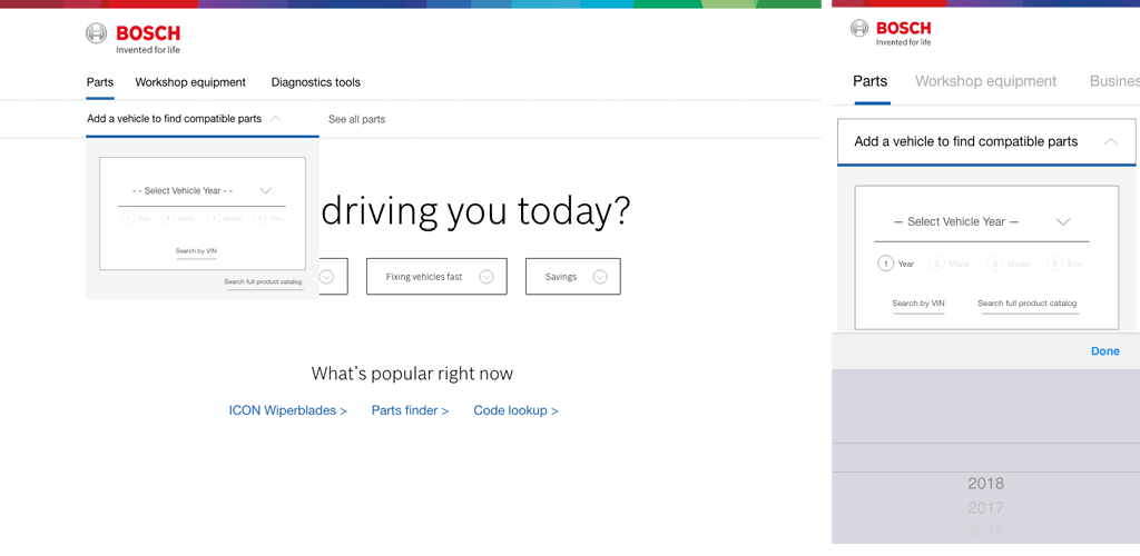
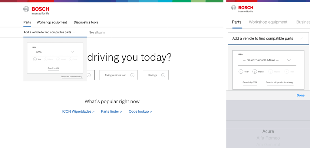
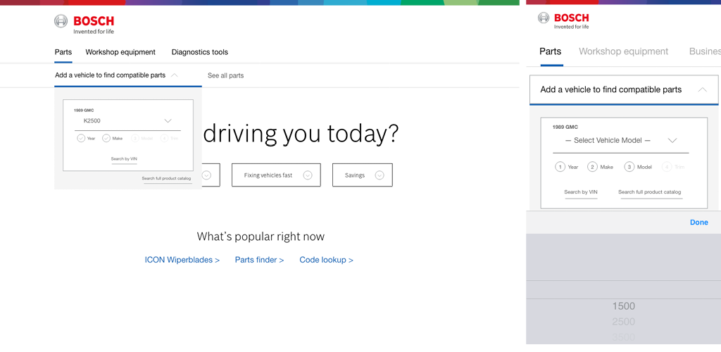
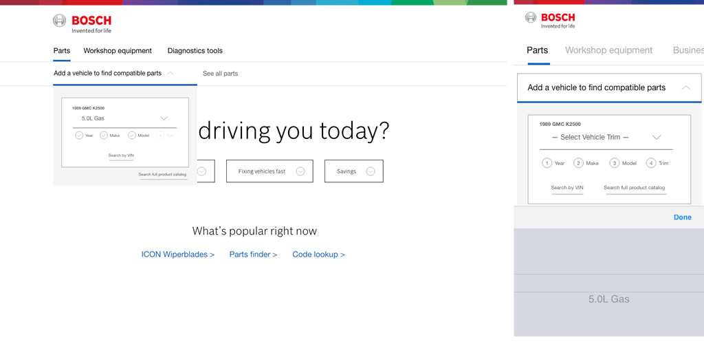
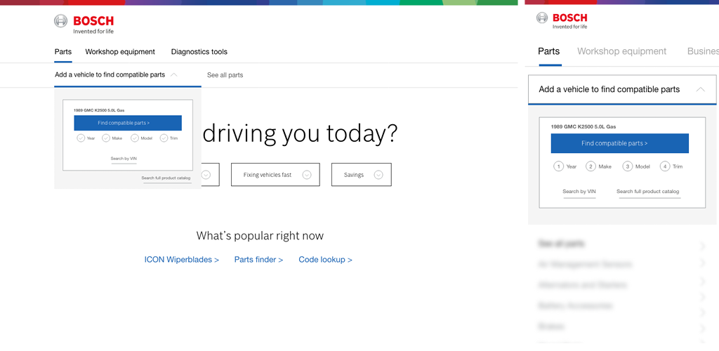
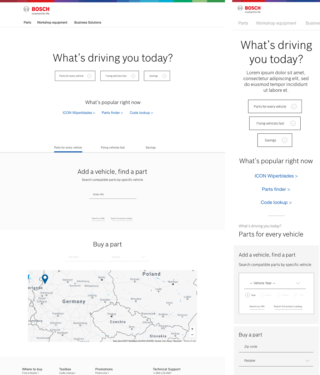
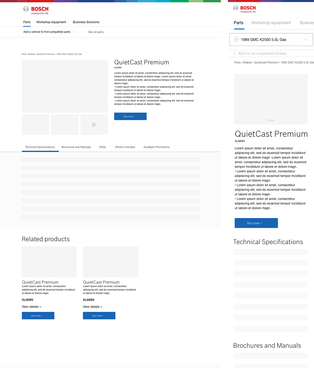
With the information architecture in place and an understanding of what the audience needs were, I created basic user flows that allowed the shop owner or technician to accomplish the primary goals of the website – add a vehicle by Year/Make/Model or VIN, find compatible parts, find local distributors, retailers or online shops for purchase.
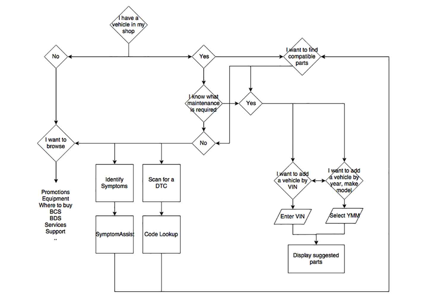
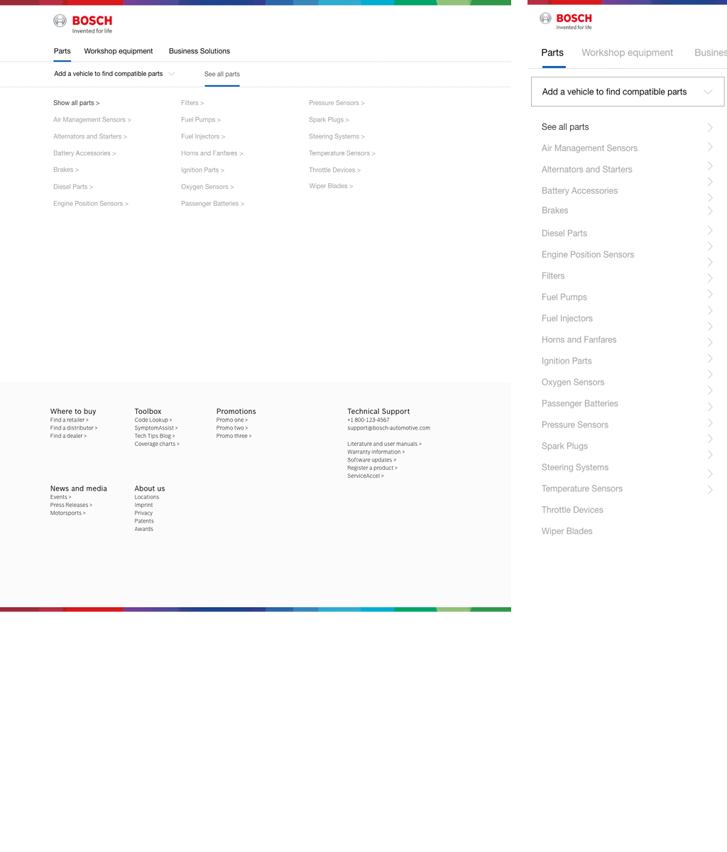
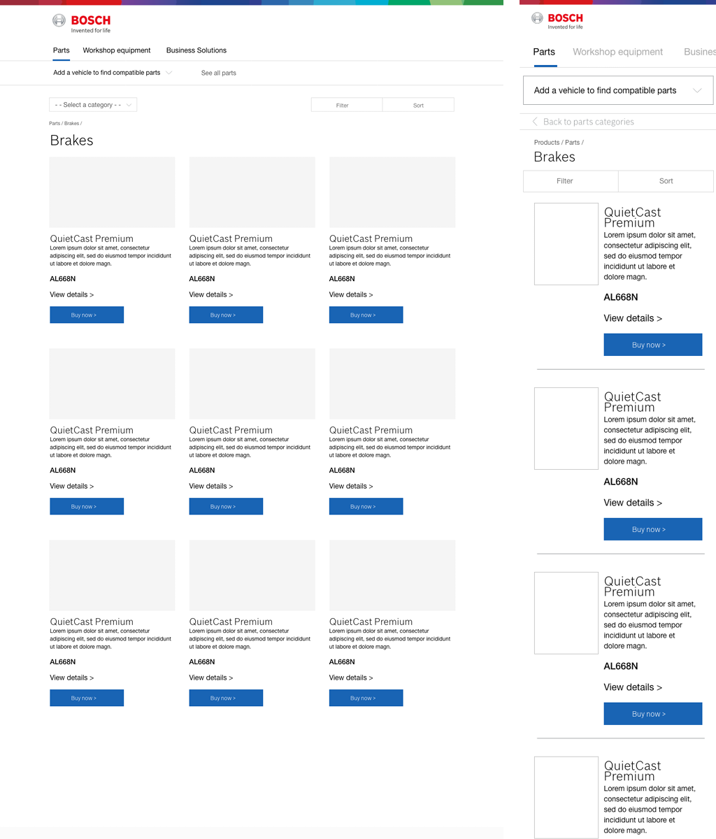
I then began low fidelity wireframes to visualize the user flows.
This example shows how a user would add a vehicle by year, make, model or VIN, then find compatible parts related to the specific vehicle. VIN is set as default because 71% (US), 75% (UK), 79% (DE) of users said they prefer to look up vehicles this way.
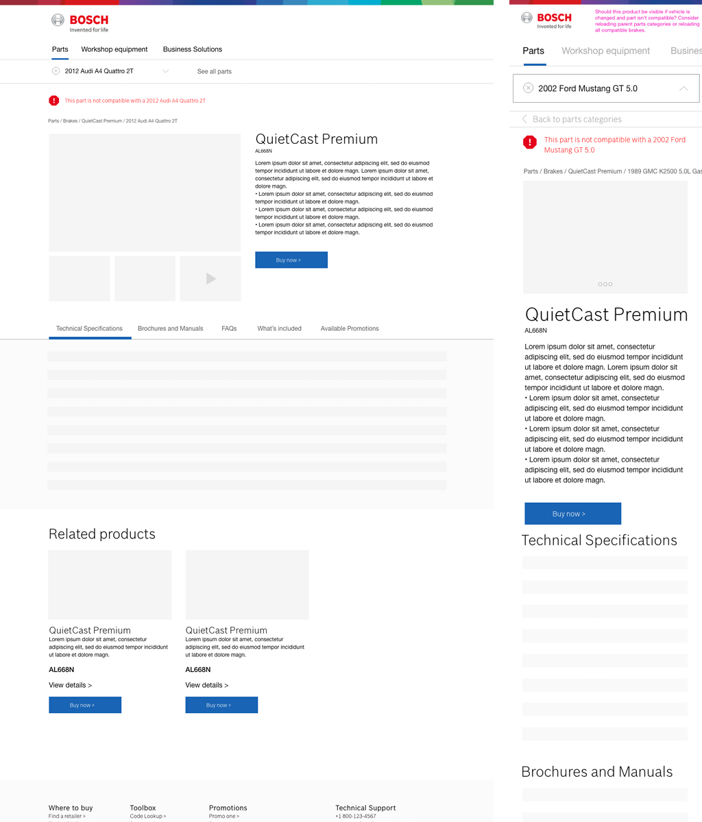
I conducted further usability tests using the low fidelity wireframes for desktop and mobile views – to validate the initial user flow and also to test the messaging that was integrated as part of the global corporate communication campaign. The messaging was confusing to the audience and translation problems were apparent when testing in various regions. The messaging was simplified by the content team, which I used as a base to create updated wireframes. Click tests and navigation tests were conducted to ensure the users were able to complete various tasks while also relating to the adjusted corporate messaging. From that point, I built high fidelity clickable prototypes to simulate the future product state in preparation for an international meeting for permission to proceed.